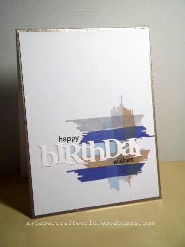
Hello … bonjour! Our wonderful new challenge starts at Time Out this morning … this fortnight, we have a cool, understated, masculine style Home Sweet Home photo to inspire you (below). Here’s where I went with it …


… and here’s the inspiration picture …

What grabs your attention in this photo … the colours and lines, as it did mine … maybe the curves of the sofa … p’raps the camera … or that huge map? However you’re inspired, we’d love to see what you create in our gallery. This time round we’re sponsored by STAMPlorations … our winner will receive a $15 GC … as well as the chance to guest design with us in a future challenge. All the details are over at the Time Out blog … along with a whole host of delicious ideas from our brilliant DT and from our talented Guest Designer, Trina from My Crafting Closet (who has a fabulous selection of wonderful cards to meander through, do go for a visit!).
I’m playing along at …
Just Us Girls – Use Something Old and/or New … my old is the AE brush stroke, my new is the SSS stamped sentiment top and bottom of the die cut (my recent first crafty order of the year!!)
Muse – Anything Goes … a fun change this week … no muse to CASE!


I so missed the trunk!! I love how you were inspired and love this design, I thought the card was one gold card base, your embossing is so neat and looks amazing. You know I tried to comment earlier from bloglovin and it never accepts my ULR for me blog and won’t allow me to comment…it always does this on our blog. Do you get other comments from bloglovin? If so, it must be my site, thought I would let you know in case others are having the same problem xx
I love the direction you went with the inspiration Anita! So amazingly classic and graphic!
Beautiful!
Super how you went with the masculine theme and made a stunning graphical card! Hugs, Gerrina
Anita, this is so eye-catching and what a wonderful take on the inspiration. The touch of gold on the edge and the way you have used the colours looks great with the white sentiment.
Love you clean and simple design and how you found your inspiration!
Thanks for sharing how you were inspired to create this fabulous masculine card. I really like the graphic and masculine feel of this card. Wow!!
There are so many details to love in this fabulous photo – you’ve chosen a few of my favorites, Anita! What a smart choice of stamps, the platinum, and colors – OH! very masculine, and handsome!
I may take this journey … you’ll have to wait to see which direction I’ll choose! xx
=]
I so love this graphic design and am WOW’ed by the way you interpreted the inspiration. I tend to go so literal on these things. You have a wonderful eye… Fantastic card Anita! Hugs, Stephanie
Wow…awesome card and interpretation of the photo! Perfect CAS design. Love it! The trunk is the inspiration for my next card. 😉
your masculine card is clean and simple perfection, anita!! love your take on the inspiration photo!!
Your eye, as usual, has created the perfect masculine card mixing those greyss, browns and blues meticulously (not easy to do, I know). The tones you chose are showcasing your sentiment beautifully. Dang, girl, your talent shows all over this card.
I’m not a blogger so I’m not sure if I am allowed to comment. But, I really like knowing how you are inspired by the picture. It helps me a lot because for the most part I copy cards and struggle to design my own.
I’ve emailed you, Mary! Anita 🙂
When I saw that challenge picture at the challenge blog my eye was caught by your card, and now to see it again up close…it is a fabulous masculine care…I will be casing it for sure Anita.
This is a brilliant take on the inspiration photo without being too literal! Thanks so much for joining us at Muse this week, Anita!
Love the graphic design on this fabulous masculine card – soooo cool! xxx
Beautiful card, love your colours 🙂
Such a perfect CAS card! Definitely good as a masculine card, but could really be for anyone, I think.
How clever you are, Anita!, I love the colors you picked up from the inspiration photo and the graphic design is so cool! I also love how you embossed the border behind your front panel ~ Such a great masculine card!
PS: The die cut sentiment is definitely from PTI 🙂
Fabulous take on the photo! The simple graphic design is perfect for a masculine card and you used the colors in an amazing way!
This is a tricky photo but you totally nailed it with your design and colour combo. You genius you!!
Bonjour, Anita! This is so cool and it’s a very creative take on the challenge picture! I especially love the color combo and the embossed edges. 🙂 Hideko
Great masculine card! Love the colours.
I am always very interested to see how you were inspired by a photo challenge and was not disappointed with another one of your very creative takes! Also love the embossed frame!
This is quite dapper and masculine indeed!! What a fabulous card Anita!
I love your the clean lines and masculine palette of your card. And what an inspiration photo!!! I wish I wasn’t separated from my beloved crafting supplies by 12,000 miles at the moment (I’m in Australia visiting family until early September).
I love your original take on the challenge, Anita! Your stamping looks amazing and I love the color combo you used. Wonderful design and greta for guys! Love it!
Fabulous card Anita, great graphic feel and love the colour combo
I really like this card and a good one to showcase to my fellow card makers and students. Love that it is a masculine card and I love brushstroke stamps. Merci
Beautiful graphic design Anita. Love your interpretation of the photo inspiration. xx
Absolute perfection Anita~LOVE your take of the photo!
This is one awesome masculine birthday card!
I really, really love your guy card! Well done, my friend.
Really great masculine card Anita – I love how you were inspired by the colours in the photo. I love the metallic border you created around the card panel – the perfect finishing touch! Great design!
OH I love this masculine card ! I love how you interpreted the photo, you’re so clever! Love the brush stamp and it is very beautiful with this combo of colours. Another wonderful card. Thanks for sharing and for inspiring! Bises.
Love the masculine look! Great CAS card – I love the touch of gold for the border, so pretty. Jenny x
Muse loved this as much as I did…another feather in your cap. Congratulations.
What a brilliant way to use that stamp set – I have the similar PTI one and I’m never quite sure what to do with it. You’ve inspired me!
Awesome take on the photo, love how you’ve crossed the brushstrokes. 🙂
Anita what a wonderful card inspired by the Time Out photo, love the colours and your serene design. Thank you so much for joining us at Muse and congratulations on the shout out too! Hope you are having a lovely summer. xo
You’ve translated a wonderful selection of objects into your card, Anita! Graphic and handsome! Love it!
Hugs and love,~c